The FileManager triggers two Read requests when double clicking a folder in the ListView/GridView. The behavior can be observed in the Basic Usage Demo.
When navigationg to a folder in the TreeView using a single click, the component triggers a single Read request.
Could you consider optimizing the request handling when navigating to nested folders, particularly in ListView/GridView, to reduce redundant Read calls and improve performance?
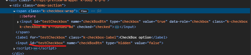
Currenty, when the Grid is in InCell edit mode, if a column binds to a boolean field, it is required a custom logic to display the field as a checkbox, which is always in edit mode and can be updated through a single click. Here is a REPL sample that shows the example:
https://netcorerepl.telerik.com/GJOhEIkj47P2xHf709
My opinion is that this functionality should work correctly out of the box without additional coding. If this is not available, then there should be an applicable sample code.
Is it possible to make an example where EF, Dirty works, no double click required and the checkbox always looks like a checkbox?
Starting with version 2025.2.520, the toolbar tools like "Save changes" and "Cancel changes" are hidden by default. When the ShowInactiveTools(true) option is set, the inactive tools are displayed as disabled until a change in the Grid's data is made (for example, the tools are active when the edited cell is closed).
Is it possible to create an option that enables the previous behavior of the inactive toolbar tools - to keep the tools always active and visible no matter if there is a change or not?
For example:
.ToolBar(toolbar =>toolbar
            .Items(itm =>
            {
                itm.Create();
                itm.Save();
            })
            .EnableInactiveTools(true)
)
Hello,
I have a treeview that is getting the first items which are locations, then it loads divisions as its children. I want to have the treeview load a top item called "Locations" that is static. It will need to be expanded and load all the locations under it. Then when I click on a location it loads the divisions. The locations and divisions will be populated by a call to the controller and action. I have yet figured out how to do this and is it even possible? Here is the code I have right now. You will see for now that I am loading a div with the location icon and "Locations" as the text, but I would like this to be the top root level of the treeview.

Currently, if a PDFViewer is opened on a mobile device and we use two fingers to zoom its content, the file is zoomed but the more we zoom it, the blurrier its content becomes. The reason for this is the fact that when we use "pinch-zoom" to zoom the PDF file(in a PDFViewer) it is zoomed using the browser's zoom functionality and not the functionality provided by the PDFViewer component.
It will be a very useful feature if the built-in PDFViewer zoom functionality is used when the user zooms content with two fingers, on a mobile device
Description
File Manager refresh changes the selected item.
Refresh should not change the selected item if it is available after refresh.
If the selected item is not available after refresh, Preview pane should show No File Selected.
Reference
https://demos.telerik.com/aspnet-core/filemanager
Error
Select Documents folder in Tree View then Excel Document in List View. Excel Document is shown in the Preview pane.
Refresh the File Manager using jQuery in Console.
$("#filemanager").getKendoFileManager().refresh()Excel Document is not selected and Preview pane shows Documents.
Refresh changed the selected item.
Expected behavior
Selected file does not change after refresh.
Example Windows File Explorer. Select a file in the folder and press F5 to refresh the folder.
Hi Team,
I noticed there is an Azure Blob Storage example with the UI for ASP.NET Core Upload, but there is not an example with Chunk Upload. I would like to request an example be provided in your documentation.
Thank you!
Hi Team,
I would like to request to add an Html/Tag Helper for the kendo.ui.icon.
Thanks!
Currently, when exporting a file from the Spreadsheet that contains named ranges, which refer to invalid or missing references (e.g., "#REF!"), the exported file is corrupted when attempting to open it in Excel:
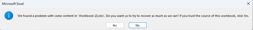
Is it possible to remove any invalid named ranges before exporting the file to avoid such a warning when opening the file in Excel? Alternatively, rewrite the invalid named ranges in the exported file, so they are ignored by Excel when opening the exported file.
By default, when opening a file with invalid named ranges in Excel, there is no automatic warning to the user.
I'm in the process of rewriting all Kendo components to use CSP compatible templates. I'm looking at https://docs.telerik.com/aspnet-core/html-helpers/template/overview which shows how we'd use TemplateComponentName() for popup editors and that we would need to rewrite everything in the popup editor to use Kendo Template's AddHtml or AddComponent methods.
Original:
<div class="mb-2 row required">
	@Html.LabelFor(model => model.FileName, new { @class = "col-sm-4 col-form-label fw-bold text-sm-end" })
	<div class="col-sm-6">
		@(Html.Kendo().TextBoxFor(model => model.FileName).HtmlAttributes(new { @class = "w-100" }))
	</div>
</div>

<div class="mb-2 row">
	@Html.LabelFor(model => model.FileDescription, new { @class = "col-sm-4 col-form-label fw-bold text-sm-end" })
	<div class="col-sm-6">
		@(Html.Kendo().TextBoxFor(model => model.FileDescription).HtmlAttributes(new { @class = "w-100" }))
	</div>
</div>
Rewritten:
@(Html.Kendo().Template()
	.AddHtml("<div class='mb-2 row required'>")
	.AddHtml(@<text>
		@Html.LabelFor(model => model.FileName, new { @class = "col-sm-4 col-form-label fw-bold text-sm-end" })
	</text>)
	.AddHtml("<div class='col-sm-6'>")
	.AddComponent(c => c.TextBoxFor(model => model.FileName).HtmlAttributes(new { @class = "w-100" }))
	.AddHtml("</div></div>")

	.AddHtml("<div class='mb-2 row'>")
	.AddHtml(@<text>
		@Html.LabelFor(model => model.FileDescription, new { @class = "col-sm-4 col-form-label fw-bold text-sm-end" })
	</text>)
	.AddHtml("<div class='col-sm-6'>")
	.AddComponent(c => c.TextBoxFor(model => model.FileDescription).HtmlAttributes(new { @class = "w-100" }))
	.AddHtml("</div></div>")
)
While this works, this markup seems much harder to read than the original. Could this be made to be simpler? Ideally I'd like to be able to drop my existing mix of html and kendo components in one method and it'd parse through to render the template properly.
Currently, the Editor's ImageBrowser dataSource only uses the default name, size, and type fields: https://docs.telerik.com/kendo-ui/api/javascript/ui/editor/configuration/imagebrowser.schema.model.fields#imagebrowserschemamodelfields
Additional custom fields coming with the response (sent back to the client by the specified end point) are ignored and are not accessible in the ImageBrowser's dataSource.
I'm using an OData datasource to populate the grid. To make matters worse, the Autocomplete retrieves data for *all* of the grid columns. I'd say the default behavior should only retrieve the current column's data and preferably use OData groupby to limit the results to distinct values.
Interestingly, the CheckBoxList filter *is* populated from the current grid data, behaving as expected.
My page is attached and the issue is occurring in the detail grid where Server Filtering is disabled.