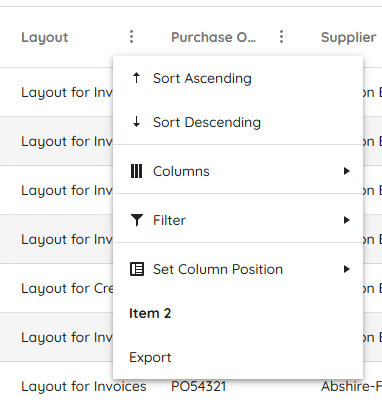
Starting with version 2025.2.520, the toolbar tools like "Save changes" and "Cancel changes" are hidden by default. When the ShowInactiveTools(true) option is set, the inactive tools are displayed as disabled until a change in the Grid's data is made (for example, the tools are active when the edited cell is closed).
Is it possible to create an option that enables the previous behavior of the inactive toolbar tools - to keep the tools always active and visible no matter if there is a change or not?
For example:
.ToolBar(toolbar =>toolbar
            .Items(itm =>
            {
                itm.Create();
                itm.Save();
            })
            .EnableInactiveTools(true)
)
Hello,
I have a treeview that is getting the first items which are locations, then it loads divisions as its children. I want to have the treeview load a top item called "Locations" that is static. It will need to be expanded and load all the locations under it. Then when I click on a location it loads the divisions. The locations and divisions will be populated by a call to the controller and action. I have yet figured out how to do this and is it even possible? Here is the code I have right now. You will see for now that I am loading a div with the location icon and "Locations" as the text, but I would like this to be the top root level of the treeview.
The Kendo UI for jQuery TreeList provides options for configuring the settings of the Window when using Popup editing mode:
Currently, the Window options are not available for the HtmlHelper and TagHelper TreeList. Is it possible to implement the Window() configuration of the Editable() option, as per the example below?
        .Editable(e =>
        {
            e.Mode("popup");
            e.Window(w => w.AppendTo("..").Animation(false).Draggable(false).Title("..."));
        })
Currently, if a PDFViewer is opened on a mobile device and we use two fingers to zoom its content, the file is zoomed but the more we zoom it, the blurrier its content becomes. The reason for this is the fact that when we use "pinch-zoom" to zoom the PDF file(in a PDFViewer) it is zoomed using the browser's zoom functionality and not the functionality provided by the PDFViewer component.
It will be a very useful feature if the built-in PDFViewer zoom functionality is used when the user zooms content with two fingers, on a mobile device
Description
File Manager refresh changes the selected item.
Refresh should not change the selected item if it is available after refresh.
If the selected item is not available after refresh, Preview pane should show No File Selected.
Reference
https://demos.telerik.com/aspnet-core/filemanager
Error
Select Documents folder in Tree View then Excel Document in List View. Excel Document is shown in the Preview pane.
Refresh the File Manager using jQuery in Console.
$("#filemanager").getKendoFileManager().refresh()Excel Document is not selected and Preview pane shows Documents.
Refresh changed the selected item.
Expected behavior
Selected file does not change after refresh.
Example Windows File Explorer. Select a file in the folder and press F5 to refresh the folder.
Currently, when dynamically appending menu items using the append() method, there is no built-in support to specify an icon via an icon, iconClass, or similar property — unlike other Kendo UI components such as kendo.ui.Button, which allow this directly.
To include an icon today, we must use inline HTML within the text property and set encoded: false, like so:
menu.append({
    text: '<span class="k-icon k-i-plus"></span> Add Item',
    encoded: false
});
While this workaround functions, it's not as clean or consistent as using a dedicated iconClass or icon option.
Please consider adding official support for an iconClass, icon, or similar property when using append() with kendo.ui.Menu, aligning it with how other Kendo components handle icons.
This would:
- Improve API consistency across Kendo components.
- Simplify code for dynamic menu updates.
- Eliminate reliance on raw HTML and manual encoding flags.
Consider the use of TextWriter async methods for the HTML Helpers, for example the WriteInitializationScript methods. In certain scenarios the use of the synchronous methods causes an exception: System.InvalidOperationException: Synchronous operations are disallowed. Call WriteAsync or set AllowSynchronousIO to true instead.
This can be resolved by explicitly enabling synchronous operations
services.Configure<IISServerOptions>(options =>
    {
        options.AllowSynchronousIO = true;
    });
though synchronous operations have been disabled by default at framework level as of .NET 3.0.
Currently, the Content function for Steps in a Wizard only accepts a string value (see API here).
This means that in order to add a partial view (bound to the current model and its properties), the most straightforward way I could find was to put the partial view (and any wrappers) in its own file and add an extension method "ToHtmlString()". For example:
@model MyModel
@(Html.Kendo().Wizard().Steps(step => {
step.Add().Content(Html.Partial("~/Path/To/View/Wrapper.cshtml", Model).ToHtmlString());
})
using Microsoft.AspNetCore.Html;
using System.IO;

public static class HtmlContentExtensions
{
    public static string ToHtmlString(this IHtmlContent htmlContent)
    {
        if (htmlContent is HtmlString htmlString)
        {
            return htmlString.Value;
        }

        using StringWriter writer = new();
        htmlContent.WriteTo(writer, System.Text.Encodings.Web.HtmlEncoder.Default);
        return writer.ToString();
    }
}In the Telerik TabStrip, a better approach is possible, as the Content for Items can take in a function which accepts Razor syntax (see API here). For instance:
@model MyModel

@(Html.Kendo().TabStrip().Items(tabstrip => {

    tabstrip.Add()    .Content(@<div id="@Model.TabContainer" class="myTabWrapperClass">        @await Html.PartialAsync("~/Path/To/View.cshtml", Model)    </div>);

})
If we had the option to use the same approach with Wizard Steps, that would be ideal!
.Items(items =>
{
    items.Add()
        .Field(f => f.Type)
        .Label(l => l.Text("Type:"))
        .Editor(e =>
        {
            e.Upload()
        }
}Hi Team,
I noticed there is an Azure Blob Storage example with the UI for ASP.NET Core Upload, but there is not an example with Chunk Upload. I would like to request an example be provided in your documentation.
Thank you!
Hi Team,
I would like to request to add an Html/Tag Helper for the kendo.ui.icon.
Thanks!
Currently, when exporting a file from the Spreadsheet that contains named ranges, which refer to invalid or missing references (e.g., "#REF!"), the exported file is corrupted when attempting to open it in Excel:
Is it possible to remove any invalid named ranges before exporting the file to avoid such a warning when opening the file in Excel? Alternatively, rewrite the invalid named ranges in the exported file, so they are ignored by Excel when opening the exported file.
By default, when opening a file with invalid named ranges in Excel, there is no automatic warning to the user.
I'm in the process of rewriting all Kendo components to use CSP compatible templates. I'm looking at https://docs.telerik.com/aspnet-core/html-helpers/template/overview which shows how we'd use TemplateComponentName() for popup editors and that we would need to rewrite everything in the popup editor to use Kendo Template's AddHtml or AddComponent methods.
Original:
<div class="mb-2 row required">
	@Html.LabelFor(model => model.FileName, new { @class = "col-sm-4 col-form-label fw-bold text-sm-end" })
	<div class="col-sm-6">
		@(Html.Kendo().TextBoxFor(model => model.FileName).HtmlAttributes(new { @class = "w-100" }))
	</div>
</div>

<div class="mb-2 row">
	@Html.LabelFor(model => model.FileDescription, new { @class = "col-sm-4 col-form-label fw-bold text-sm-end" })
	<div class="col-sm-6">
		@(Html.Kendo().TextBoxFor(model => model.FileDescription).HtmlAttributes(new { @class = "w-100" }))
	</div>
</div>
Rewritten:
@(Html.Kendo().Template()
	.AddHtml("<div class='mb-2 row required'>")
	.AddHtml(@<text>
		@Html.LabelFor(model => model.FileName, new { @class = "col-sm-4 col-form-label fw-bold text-sm-end" })
	</text>)
	.AddHtml("<div class='col-sm-6'>")
	.AddComponent(c => c.TextBoxFor(model => model.FileName).HtmlAttributes(new { @class = "w-100" }))
	.AddHtml("</div></div>")

	.AddHtml("<div class='mb-2 row'>")
	.AddHtml(@<text>
		@Html.LabelFor(model => model.FileDescription, new { @class = "col-sm-4 col-form-label fw-bold text-sm-end" })
	</text>)
	.AddHtml("<div class='col-sm-6'>")
	.AddComponent(c => c.TextBoxFor(model => model.FileDescription).HtmlAttributes(new { @class = "w-100" }))
	.AddHtml("</div></div>")
)
While this works, this markup seems much harder to read than the original. Could this be made to be simpler? Ideally I'd like to be able to drop my existing mix of html and kendo components in one method and it'd parse through to render the template properly.
Currently, the Editor's ImageBrowser dataSource only uses the default name, size, and type fields: https://docs.telerik.com/kendo-ui/api/javascript/ui/editor/configuration/imagebrowser.schema.model.fields#imagebrowserschemamodelfields
Additional custom fields coming with the response (sent back to the client by the specified end point) are ignored and are not accessible in the ImageBrowser's dataSource.


