Use the following setup:
private void RadForm1_Load(object sender, EventArgs e)
{
// TODO: This line of code loads data into the 'nwindDataSet.Orders' table. You can move, or remove it, as needed.this.ordersTableAdapter.Fill(this.nwindDataSet.Orders);
this.radPivotGrid1.RowGroupDescriptions.Add(new DateTimeGroupDescription() { PropertyName = "OrderDate", Step = DateTimeStep.Year, GroupComparer = new GroupNameComparer() });
this.radPivotGrid1.RowGroupDescriptions.Add(new DateTimeGroupDescription() { PropertyName = "OrderDate", Step = DateTimeStep.Quarter, GroupComparer = new GroupNameComparer() });
this.radPivotGrid1.RowGroupDescriptions.Add(new DateTim
eGroupDescription() { PropertyName = "OrderDate", Step = DateTimeStep.Month, GroupComparer = new GroupNameComparer() });
this.radPivotGrid1.ColumnGroupDescriptions.Add(new PropertyGroupDescription() { PropertyName = "EmployeeID", GroupComparer = new GrandTotalComparer() });
this.radPivotGrid1.AggregateDescriptions.Add(new PropertyAggregateDescription() { PropertyName = "Freight", AggregateFunction = AggregateFunctions.Sum });
this.radPivotGrid1.AggregateDescriptions.Add(new PropertyAggregateDescription() { PropertyName = "Freight", AggregateFunction = AggregateFunctions.Average });
this.radPivotGrid1.FilterDescriptions.Add(new PropertyFilterDescription() { PropertyName = "ShipCountry", CustomName = "Country" });
this.radPivotGrid1.DataSource = this.ordersBindingSource;
this.radPivotGrid1.ChartDataProvider.UpdateCompleted += radPivotGrid1_UpdateCompleted;
this.radChartView1.DataSource = this.radPivotGrid1;
}
private void radPivotGrid1_UpdateCompleted(object sender, EventArgs e)
{
foreach (CartesianSeries series inthis.radChartView1.Series)
{
series.ShowLabels = true;
series.LabelRotationAngle = 90;
}
}
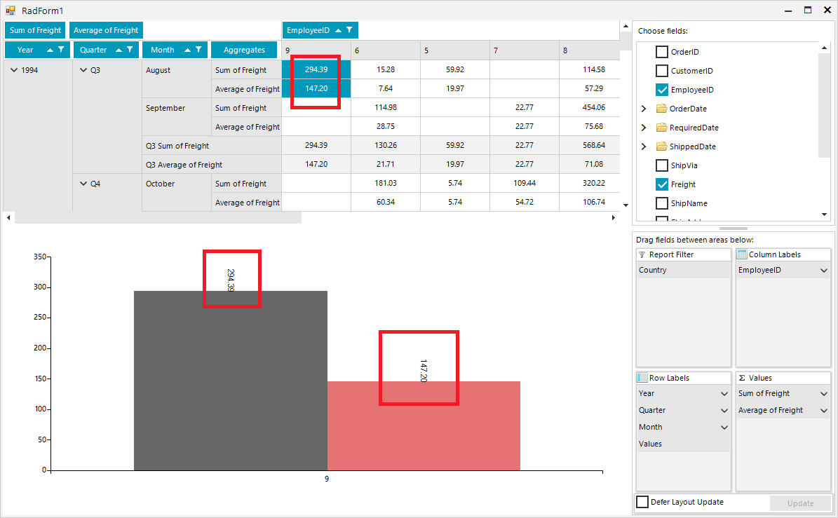
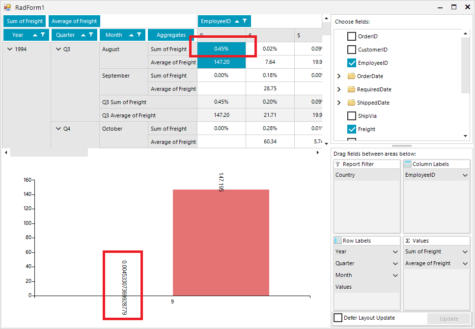
Once you select "% of Grand Total" for one of the aggregates, it would be good the respective chart labels to be formatted in a similar way out of the box:

Desired Behavior:
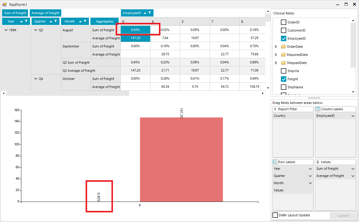
Actual behavior:
Improve performance, when calculating the positions of Smart Labels.
Good day,
My requierment is to have a RadChartView with a LineSeries and a RangeSeries. I add CategoricalDataPoint objects manually to the LineSeries and I manually add RangeDataPoint objects to the RangeSeries.
When I encounter NULL valued datapoints, for the LineSeries, I do the following. The NULL valued datapoints appear as gaps in the chart as expected.
Dim value As Nullable(Of Double)
Dim serControl  As  LineSeries

serControl = New LineSeries()
chart.Series.Add(serControl)
value = IIf(IsDBNull(dr(data.ControlParameter.ID.ToString())), New Nullable(Of Double), dr(data.ControlParameter.ID.ToString()))
serControl.DataPoints.Add(New Telerik.Charting.CategoricalDataPoint(value))
However the RangeSeries do not handle the NULL valued datapoints the same. I get the following error: Nullable object must have a value.
Dim LowerBound, UpperBound As Nullable(Of Double)
Dim serRange  As  RangeSeries

serRange = New RangeSeries()
chart.Series.Add(serRange)
LowerBound = IIf(IsDBNull(dr("Lowerbound"), New Nullable(Of Double), dr("LowerBound"))
UpperBound = IIf(IsDBNull(dr("Upperbound"), New Nullable(Of Double), dr("UpperBound"))
serRange.DataPoints.Add(New Telerik.Charting.RangeDataPoint(UpperBound, LowerBound))
I need to be able to show gaps, not zero's in a RangeSeries when there are NULL values.
How can I do this?
It would be great to be able to generate Box Plot graphics, both in the RadCharView control and in the Report.
When setting the border color of the axis the labels are showing a border with the same color. The color is inherited from the axis element. One should be able to easily disable this, or it should not happen.

How to reproduce:
public partial class RadForm1 : Telerik.WinControls.UI.RadForm
{
    LineSeries lineSeries;

    public RadForm1()
    {
        InitializeComponent();

        this.lineSeries = new LineSeries();

        this.lineSeries.DataPoints.Add(new CategoricalDataPoint(20, "Jan"));
        this.lineSeries.DataPoints.Add(new CategoricalDataPoint(22, "Apr"));
        this.lineSeries.DataPoints.Add(new CategoricalDataPoint(25, "Jul"));
        this.lineSeries.DataPoints.Add(new CategoricalDataPoint(19, "Oct"));

        this.radChartView1.Series.Add(this.lineSeries);

        this.lineSeries.HorizontalAxis.BorderColor = Color.Green;
        this.lineSeries.VerticalAxis.BorderColor = Color.Blue;
    }
}

Workaround: iterate each of the axis labels and set their border color to Transparent
public partial class RadForm1 : Telerik.WinControls.UI.RadForm
{
    LineSeries lineSeries;

    public RadForm1()
    {
        InitializeComponent();

        this.lineSeries = new LineSeries();

        this.lineSeries.DataPoints.Add(new CategoricalDataPoint(20, "Jan"));
        this.lineSeries.DataPoints.Add(new CategoricalDataPoint(22, "Apr"));
        this.lineSeries.DataPoints.Add(new CategoricalDataPoint(25, "Jul"));
        this.lineSeries.DataPoints.Add(new CategoricalDataPoint(19, "Oct"));

        this.radChartView1.Series.Add(this.lineSeries);

        this.lineSeries.HorizontalAxis.BorderColor = Color.Green;
        this.lineSeries.VerticalAxis.BorderColor = Color.Blue;
    }

    protected override void OnShown(EventArgs e)
    {
        base.OnShown(e);

        foreach (var item in this.lineSeries.VerticalAxis.Children)
        {
            AxisLabelElement label = item as AxisLabelElement;
            if (label != null)
            {
                label.BorderColor = Color.Transparent;
            }
        }

        foreach (var item in this.lineSeries.HorizontalAxis.Children)
        {
            AxisLabelElement label = item as AxisLabelElement;
            if (label != null)
            {
                label.BorderColor = Color.Transparent;
            }
        }
    }
}
The new functionality should allow a display similar to the one in the WPF pie series:
http://docs.telerik.com/devtools/wpf/controls/radchartview/features/labels/smart-labels#using-smart-labels-in-radpiechart
How can I achieve the same behaviour as with the obsolete RadChart plotting the area between the maxima of a sine.
Introduce gantt like series as in RadChart: http://docs.telerik.com/devtools/winforms/chart/understanding-radchart-types/gantt-charts
Note: when you apply a palette the series doesn't have hover and selection indication.
Gets the range that is actually visible on the plot area when the chart is zoomed in.
To reproduce:

AreaSeries areaSeries = new AreaSeries();
areaSeries.DataPoints.Add(new CategoricalDataPoint(13, "Jan"));
areaSeries.DataPoints.Add(new CategoricalDataPoint(20, "Apr"));
areaSeries.DataPoints.Add(new CategoricalDataPoint(15, "Jul"));
areaSeries.DataPoints.Add(new CategoricalDataPoint(16, "Oct"));
this.radChartView1.Series.Add(areaSeries);

areaSeries.BackColor = Color.Transparent;

areaSeries.CombineMode = ChartSeriesCombineMode.Stack;
AreaSeries areaSeries2 = new AreaSeries();
areaSeries2.DataPoints.Add(new CategoricalDataPoint(15, "Jan"));
areaSeries2.DataPoints.Add(new CategoricalDataPoint(25, "Apr"));
areaSeries2.DataPoints.Add(new CategoricalDataPoint(27, "Jul"));
areaSeries2.DataPoints.Add(new CategoricalDataPoint(18, "Oct"));
this.radChartView1.Series.Add(areaSeries2);
areaSeries2.CombineMode = ChartSeriesCombineMode.Stack;

 The area underneath the transparent one shouldn't be displayed in this case because they are stacked.  There is no area underneath the bottom layer to display. They are each STACKED on top of each other, they should not be layered in front of each other.
Until the feature gets implemented please use the suggested solution here: http://www.telerik.com/support/kb/winforms/details/integrating-panzoom-trackball-and-lassozoom-controllers-in-radchartview