Consider exposing a template that will allow styling the (Optional) text span from ThemeBuilder.
Currently, as a workaround users must explicitly set the styles through the following selectors:
.k-stepper .k-step-label-optional {
    color: red;
    background-color: yellow;
    font-size: 18px;
    font-style: normal;
}
Requested through t.1648985
Hello,
We have been creating custom variables for a color palette that our design system uses. However, we are unable to set any of the global properties (ie. text color) to one of the custom variables we have created. The list of variable options is limited to the "Theme Colors." We can set the color manually by setting the hex color it would be great if we could use our custom variables, especially if the list of global variables grows in the future.
Thank you for consideration of this feature!
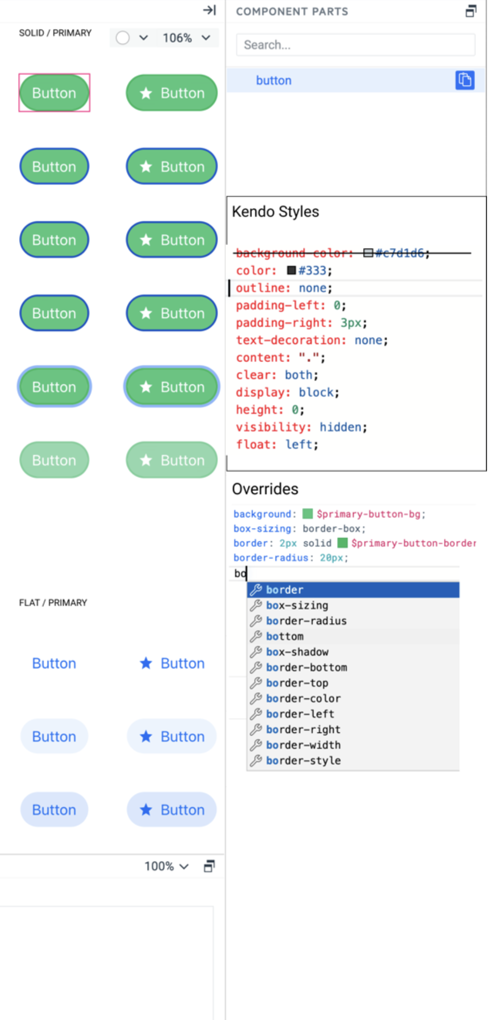
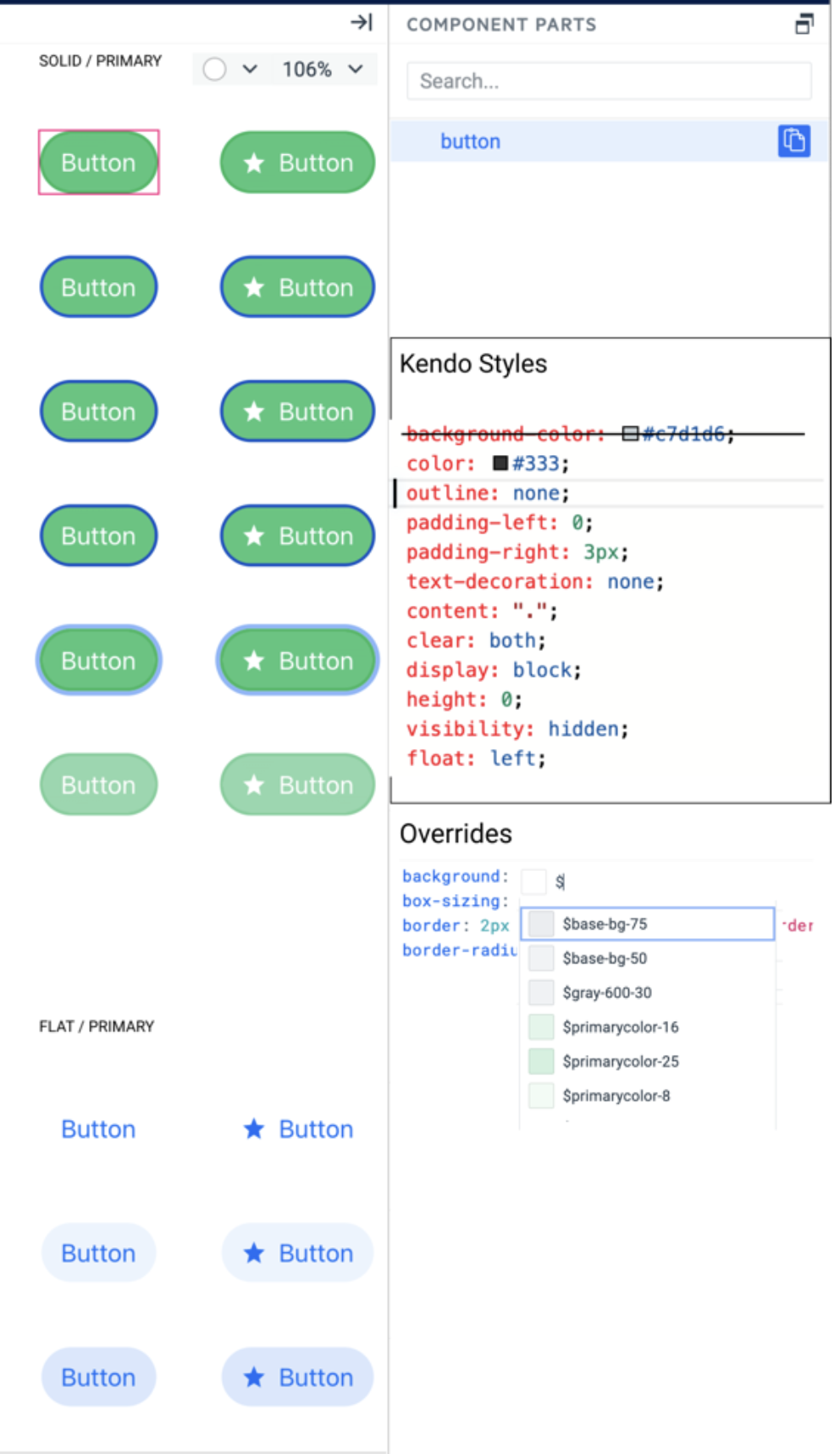
Add a new smart code editor as a variant of the Property Grid with all visual properties. Do not replace the property grid with this editor. They can live next to each other in different tabs. The smart code editor should support all features of the property grid but with advanced functionalities.
1. Show all kendo styles attached to the selected layer in a text format
2. Marks which style is overridden by user styles
3. Users can add any CSS property, not just the one listed by the Proprty grid editors.
4. Intellisense for CSS properties, something like:
5. Intellisense for using sass/css variables – the editor can recognize the property name and list only corresponding tokens for example – background – shows color tokens, box-shadow – shows effect tokens. Something like:
As the subject suggests, I think the ability to support multiple swatches in a single project would be a fantastic addition to Themebuilder!
This change would allow a user to select a theme that'll encompass an app's light mode, and once finished, select a separate theme to repeat the process for dark.
As it currently stands, separate Themebuilder projects need to be created in order to separate light and dark themes.
Thank you in advance for your consideration!
Consider the option to expose predefined classes of HTML elements from the Kendo themes. This would allow atomic customization and mapping to other imported variables (like ones imported from Figma designs).
For example:
An option to style the H1 header from the Kendo theme, which has the .k-h1 class.
When the ThemeBuilder project has custom variables or variables exported from Figma in the output _tokens.scss file all variables are with the ‘tb’ or ‘figma’ prefix.
It will be good if these prefixes can be configuration options for the project and users can choose what prefix (or no prefix) should use.
Q: Can one css file be produced for just the components selected in ThemeBuilder?
Ideally, we would like to have the option to produce only partial themes for specific components. This will allow to minimize the size of the output CSS/SASS files, which will allow us to lower the size of the end application.
Alternative ways to achieve similar results through manual application builds: https://docs.telerik.com/themebuilder/partial-theme-build
Currently, in ThemeBuilder, each uploaded font must have a unique font family name.
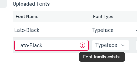
However, in some cases, we would like to add multiple font variants (files) via the same font family name (e.g., all named "Lato") and let the user control them through typography variables (from where users should be able to control the specific weight, type, etc.).
I have a grid with a column that contains clickable text in <a> tags and want it to be obvious to the user that this is clickable, by having the text display in blue.
However, there is a CSS class being applied that is preventing the styling from showing:
.k-grid a {
color: inherit;
text-decoration: none;
}
Is it possible for me to modify the styling of these links within ThemeBuilder and not have to add a custom global style override? I have not found any way of changing this.
Thanks
Currently, in ThemeBuilder, you can't style DropDownList, which uses groups.
https://demos.telrik.com/kendo-ui/dropdownlist/grouping
https://www.telerik.com/kendo-react-ui/components/dropdowns/combobox/grouping/
Consider the option to expose a template that will allow adding custom styles for DropDownList with grouping.
Requested through t.1645162
Consider providing public API endpoints for different ThemeBuilder functionalities, such as export options. This will allow users to provide automated distribution of the theme.
Requested through t.1644512
Allow customisation of frozen and locked columns & cells in Grid for more comprehensive component styling.
Steps to reproduce the bug
In Themebuilder:
- enable Advanced edit and edit the Grid component.
- Once there, in Grid Construction Elements, go to the GRID DEFAULT part.
- In the top-right element tree area, go in <div> Grid ---> <table> Table.
- Once there, set the Table > Border Collapse property to Separate
- Finally try applying two different values for vertical and horizontal spacing in the Table > Border Spacing property. If necessary, apply a visible border to cells to better see the issue.
Expected behavior : The two different values should be persisted and applied.
Actual behavior : The behavior is strange and editing one value seem to overwrite the other.
In ThemeBuilder Q1 2024 there are Grid templates for styling alternate rows and selected rows. However, there is no template for styling selected alternate row.
Consider providing templates for each rendering option.
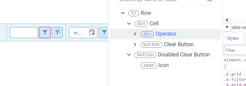
Currently, you can style only the Operator and the Clear buttons components inside the FilterRow Cell template. It would be great to have the ability to style the rest of the components (e.g. Inputs, NumericTextBox, etc.)
Request Feature...
Either: 1) Give Access To Common SASS modules/methods.
If I am using a primary color for my themebuilder customization and define it as
$my-primary-color = #2a3bd1,
give me the ability to use functions in sass like
- lighten($my-primary-color, 20%) or
- color.change($my-primary-color, $saturation: 50).
- However you do it
Or: 2) Provide swatches using the current theme colors on color picker.
Or create swatches from the current theme color in the color picker to use as starting points when picking another color representing hover or selected or disabled, etc.
ThemeBuilder only allows limited control over a specific set of exposed variables. Although these variables are constantly analyzed and updated, some, such as $base-gradient, cannot be modified through ThemeBuilder and require manual adjustments.
Example of variable that is not currently exposed: $base-gradient
The feature request is to explore the possibility of exposing more variables or providing a UI for selecting Kendo variables, bearing in mind that some Kendo themes may have over 2,000 variables.
So far the following variables were requested explicitly:
1623384: $base-gradient
1630912:
$kendo-grid-header-padding-y
$kendo-grid-padding-x
$kendo-grid-padding-y
$kendo-input-border
$kendo-input-hover-border
Hello,
I'm trying to update our themebuilder project by exporting metada (v7.0) and then importing into a new v7.2 project, but it fails.
Consider having the option to trigger the automatic migration (for ThemeBuilder Ultimate and Enterprise) and Export options simultaneously for multiple projects.
Benefits as pointed out by a user:
""...
I'd rather start a batch job performing all of those tasks (it might even be a dry run just pointing out issues) and generate some "editor-readable" results)I can then review all of the outputs in a single step, adapt those with issues, or exclude them from the next batch run, which would automatically migrate all of the projects without issues. The workflow would boil down to those themes with issues (which is perfectly fine). Right now, I have to go through all of this manually, which takes a considerable amount of time... "