Hi Team,
I would like the user to be able to add a value into the Kendo UI DateTimePicker's input with the calendar opened. Currently, if the calendar is open, the focus will be on the calendar, and it will select today's date upon pressing enter.
Thank you!
Hi Team,
I'd like to request adding the Buddhist Calendar to the Kendo UI Date/Time Pickers/Calendar.
Thank you!
Hello,
I would like to request adding a property like DisplayDate which will select the view and value of the Kendo UI DatePicker initially without setting it with the value method.
Thanks!
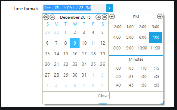
Instead of a drop down for the time choices can they be displayed so the user doesn't have to scroll through a drop down and the choices can be displayed similar to your example on UI for WinForms. Thanks.
I'd like to request adding a clear button similar to the Kendo UI ComboBox for the Kendo UI Date/Time pickers.
Thank you!
Dear support,
I didn't find in your documentation if and how we can use data-* annotations to setup dataInput options of a datepicker.
I would like to do the same thing that the code below does but with MVVM data-* annotation.
            self.date= $('#dateExample').kendoDatePicker({
                format: 'dd.MM.yyyy',
                dateInput: true,
            }).data('kendoDatePicker');
            self.date._dateInput.setOptions({
                format: 'dd.MM.yyyy',
                messages: {
                    'year': 'yyyy',
                    'month': 'mm',
                    'day': 'dd'
                }
I globally use data-bind for html and kendo UI components.
I just added the data-format in my html like below, and it works.
<input data-role="datepicker" id="dateExample" data-format="dd.MM.yyyy" data-bind="value: myValue">I wonder if we can setup format and messages options for the dateinput of the datepicker with MVVM without using jquery (with something like data-dateinput, data-dateinput-format, data-dateinput-messages...).
Thanks in advance for your usual support.
Regards,
Charline.
Parsing of the users Input (defined by ParseFormats) is stopping, as soon as min date is set. This happens if the date,evaluated by the parsing, is outside the min/max range.

I would suggest, that parsing takes the min/max boundaries into account.
The editors do support inline footer's but you can't use an external footer template yet.

Example template:

<script type="text/template" id="datepicker-footer-template">

    "Today: #:kendo.toString(data, 'yyyy-MM-dd')#, Week: #:kendo.recurrence.weekInYear(data,kendo.culture().calendar.firstDay)#"

</script>

Suggestion to add a footer-template configuration option like this:

<input name="Date" data-role="datepicker" data-bind="value: Date" data-format="yyyy-MM-dd" data-week-number="true" data-footer-template="datepicker-footer-template"/>

Jan
An alternate header with Month and Year Dropdowns would be helpful on the DatePicker
I noticed that the time picker would not parse a 3 or 4 digit time w/ am/pm (that doesn't have a ":" separator) even though there wouldn't be any ambiguity based on the parseFormat array.  I was told that the picker doesn't officially support any time parsing that doesn't contain a colon and if some work without a colon it is by chance.

This vote would be for more thorough format parsing on the picker controls.  The ones I specifically noticed were failures to parse "hmmt", "hmmtt".  See this ticket for more info and a dojo example.

https://www.telerik.com/account/support-tickets/view-ticket?threadid=1164654
if we set min value just for validation for new entry...then if user retrieve old record from database which document date is before the minimum date it displays empty. so there should be read only dates available. thanks
DateInput doesn't support fuzzy dates. (Where day/month/year are optional) This is useful in order entry applications where the developer doesn't have control over what information is available from customers and information supplied is inconsistent.

The DateInput controller could have an option to read/submit formatted strings or some kind of strongly typed DTO so that given parts of the DateInput initialize as blank/null.
Have the time drop down function kind of like normal drop downs, where they don't filter, but will jump down to the time you start typing after opening the drop down like the drop downs do when you start typing after opening them.
Currently the disabled date function only make the dates disabled, but if you are using the component as a month/year picker through the "depth" property you would also like the months/years to be unselectable if the whole month is included in the disabled date period.
because dateTimePicker can show weekNr now, if it is possible to enable select whole week ( or select weekNr), Thanks
It is essential that k-ng-model integrate completely and accurately with angular.  For instance if I am using k-ng-model with a date picker and set it to required angular validation will not work.

This same issue exists with all of the kendo controls that support k-ng-model
I want the datetimepicker to pull from the database if a value exists, show nothing if it doesn't, and get the current date and time when user clicks on the calendar icon. It doesn't get the current time. It shows midnight. I can get the datetimepicker to default to today's date (on display) and current time if I don’t try and pull a value from the database.
For the datepicker control, it would be great if it could support relative values for the min and max range like the jQuery datepicker does. For instance, you can set minDate: 0, which is today. Or you can say maxDate: "+6M" for a max date of 6 months from today (as in their documentation: https://api.jqueryui.com/datepicker/#option-maxDate). These generic expressions make it much easier to set restrictions.
Date picker when entering the day or day and month to autofill the content with current year or current month and year, same as asp.net ajax datepicker
Is there any possibility to add a new property to the datepicker that will let the user to use a datepicker like the ones used in materializecss framework?

Sample here:
http://materializecss.com/forms.html#date-picker