Here is a simple example:
HTML:
<kendo-listview
  [height]="400"
  [data]="notes$ | async"
  class="k-d-flex-overflow-auto"
  (scrollBottom)="loadMore()">
  <ng-template kendoListViewHeaderTemplate>
    <span title>Reminders</span>
  </ng-template>
  <ng-template kendoListViewItemTemplate let-dataItem="dataItem">
    <app-message-note [note]="dataItem"></app-message-note>
  </ng-template>
</kendo-listview>
TS:
@Component({
  selector: 'app-message-list',
  templateUrl: `./message-list.component.html`,
  styles: [
    `
      .k-d-flex-overflow-auto {
        display: flex;
        flex-direction: column;
        flex-wrap: nowrap;
        overflow: auto;
      }
    `,
  ],
})
export class MessageListComponent implements OnInit {
  notes$: Observable<NoteDto[]>;

  constructor(private replyService: ReplyNoteService) {}

  ngOnInit(): void {
    this.notes$ = this.replyService.getUserNotesList();
  }

  loadMore() {
    console.log('loading...');
  }
}
Without these styles scroll is not visible.
Current behavior: scroll to the bottom, nothing happens.
Expected behavior: scroll to the bottom "loading..." will be logged to the browser console.
Dear Support Team,
Although I changed my locate to 'fa-IR', the kendo UI date picker did not change to Hijri or Jalali Calendar and it just translated the text of the gregorian calendar!
Is this a bug? or I should do something to use the Persian calendar?
Best regards
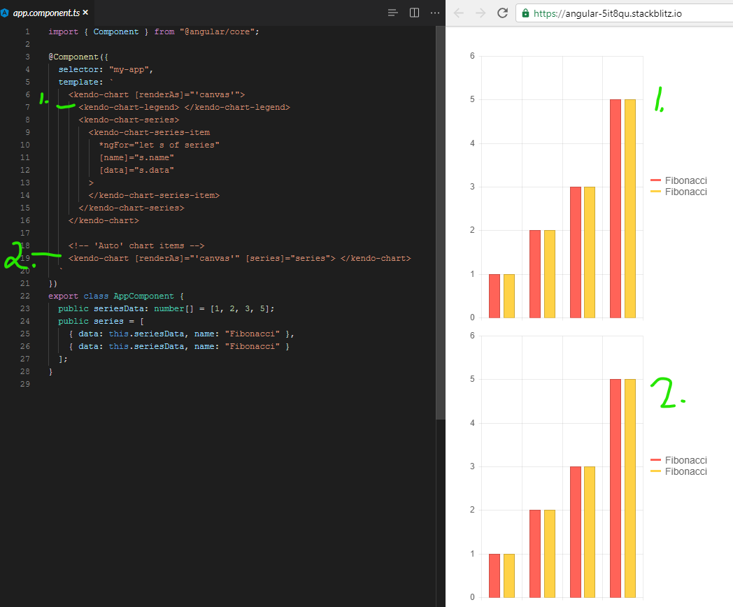
Expected: Clicking on an item in the legend is supposed to toggle it's visibility.
Using kendo-angular-charts 5.1.0, if you add a series input, this does not happen. A full, minimal reproduction of this issue is available At the StackBlitz link below. The top chart has no issues (hides series upon clicking) while the bottom does.
https://stackblitz.com/edit/angular-5it8qu?file=app%2Fapp.module.ts
Screenshots of above repro:
It appears that there is a line deep in the codebase that says:
const seriesComponent = this.seriesComponents.get(index);
if( !seriesComponent ){ return; }
seriesComponent.toggleVisibility();
And the seriesComponents array is empty when you use the [series] binding.
We even went so far as to bind to the legend click event and toggle the visibility myself, but it is 100% ignored.
It was something like:
public onLegendClick(event: LegendClickEvent){
  event.series.visibility = !event.series.visibility;
  event.source.refresh();
  event.source.changeDetector.markForCheck();
}
Calling refresh did redraw the chart, but it was still visible/enabled. Even though digging into it with ng.getComponent on the kendo-chart, and looking at the series, it clearly showed series[0].visible to be false.
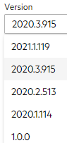
I had to make an assumption on version for this ticket since the dropdown on the bug report doesn't list 5.1.0. I wouldn't mind tips on understanding how to match up your marketing version name with your npm version. I spent 20 minutes looking around for that, but your versioning doc and release history don't seem to have anything about the actual version numbers used by package management.
As you can see from the image below the tab strip tabs can keep getting added and they do not care where the parent DIV or any other container ends. It would be appropriate for them to allow for scrolling if it goes outside the width of its container.

This is the way it is handled in jQuery
https://demos.telerik.com/kendo-ui/tabstrip/scrollable-tabs
Severity: Sev2 (High)
Test Environment: OS: Windows 11 22H2
OS Build: 23620.1000
Pre-Requisite: Set browser zoom level to 400% and display resolution: 1280x1024 (or) In dev Tools set the resolution to 320*256.
Repro steps:
1.Open URL: http://www.telerik.com/kendo-ui in edge browser.
2.Navigate to 'Kendo UI for Angular ' tab item and invoke it.
3.Navigate to the Angular chart control and invoke it.
4.In left navigation pane click Scatter control under 'series types'.
5.Navigate to 'Scatter Plot Chart'.
6.Verify whether X-axis is getting overlapped while resizing the page upto 400% of zoom or not.
Actual Result:
X-axis is getting overlapped while resizing the page upto 400% of zoom.
Expected Result:
X-axis should not get overlapped when browser zoom level set to 400%.
https://stackblitz.com/edit/angular-5elhtu?file=src%2Fapp%2Fapp.component.ts
When a detail row is used, the moment you expand one row and scroll, it automatically loads the last items from the dataset.
Ex expand row 1 - start scrolling, and it suddenly loads 5xx th row+;
When grouping is also enabled - expanding the detail row under one group, expands it under all groups.
The stackbliz is from the kendo demo page for virtualscroll (with the added detail row).
If ComboBox is used in a form and its required, screen readers will not pick up this information since it is not passed on to the underlying input field.
The example a nice workaround, but a final solution should have this automatically implemented by the control.
https://stackblitz.com/edit/angular-2ck3gu
Not sure if this is a bug in Angular CLI, Karma, or Kendo. I wrote up a bug for Angular CLI for this as well: https://github.com/angular/angular-cli/issues/20449
Issue only tested on Windows 10 x64 with Chrome 89 installed.
- Create new application:
ng new <app-name> --strict=true --style=scss --routing=true - Install
@progress/kendo-theme-defaultnpm install @progress/kendo-theme-default --save - Open
styles.scss, add the following line:@import "~@progress/kendo-theme-default/scss/all"; - Open
karma.conf.jsand change the following properties:
    autoWatch: false
    browsers: ['ChromeHeadlessCI'],
    customLaunchers: {
      ChromeHeadlessCI: {
        base: 'ChromeHeadless',
        flags: ['--no-sandbox']
      }
    },
   singleRun: true
- Run
ng test
After 2+ minutes, warning in console shows: WARN [launcher]: ChromeHeadless have not captured in 60000 ms, killing.
Then, NFO [launcher]: Trying to start ChromeHeadless again (1/2).
The second time launches without issue.
If you remove the line from styles.scss and repeat ng test, the problem is not visible.
Alternatively, check out this repo and run ng test :https://github.com/acohenOT/unit-testing
Warning indicated below:
Karma v6.1.2 server started at http://localhost:9876/
05 04 2021 12:20:05.510:INFO [launcher]: Launching browsers ChromeHeadlessCI with concurrency unlimited
05 04 2021 12:20:05.536:INFO [launcher]: Starting browser ChromeHeadless
- Generating browser application bundles (phase: building)...05 04 2021 12:22:32.075:WARN [launcher]: ChromeHeadless have not captured in 60000 ms, killing.
/ Generating browser application bundles (phase: building)...05 04 2021 12:22:32.986:INFO [launcher]: Trying to start ChromeHeadless again (1/2).
√ Browser application bundle generation complete.
05 04 2021 12:22:39.009:INFO [Chrome Headless 89.0.4389.114 (Windows 10)]: Connected on socket 6ClQVkn2c_tOxxhlAAAB with id 89607273
Chrome Headless 89.0.4389.114 (Windows 10): Executed 3 of 3 SUCCESS (0.305 secs / 0.217 secs)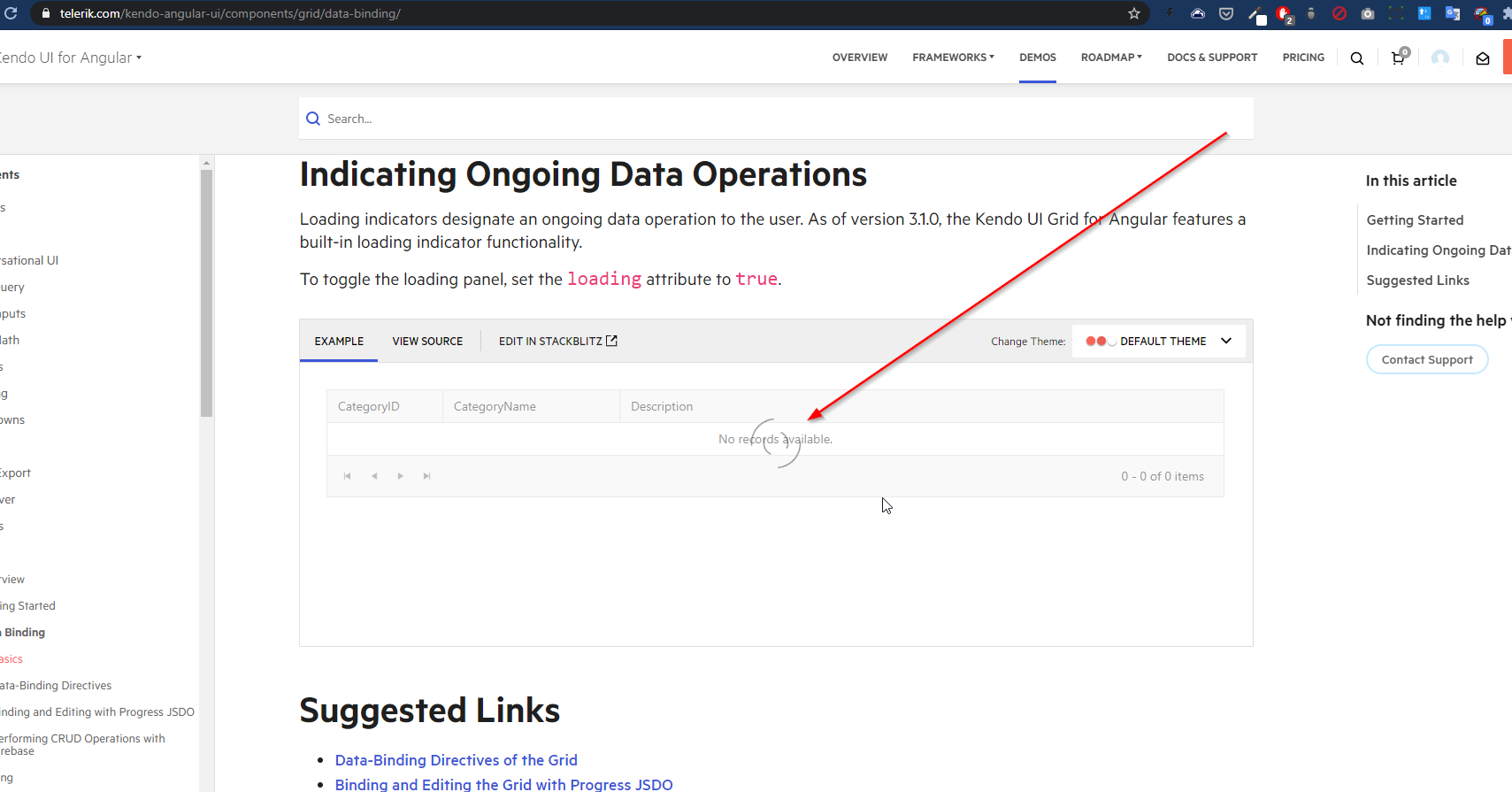
TOTAL: 3 SUCCESSWhile the grid is initially loading data, the "No records available." message is confusing and provides no useful information.
Expected behavior - when the grid is initially loading, don't display the message as the rows/data might very well appear
To reproduce basically just go to the grid demo page (refresh if needed) and pay attention to the grid loading: https://www.telerik.com/kendo-angular-ui/components/grid/data-binding/
Example in our project - intuitively you'd think that the grid has no records until you see the loader; in any case, the message looks out of place:

Steps to reproduce:
1. Run application and open the schedule component
2. Start drag the element on schedule to new place and drop it.
After that whole schedule component will blink(in Chrome, for example, all OK).
Hello,
The PDF export component does not seem to handle tables that are in the editor content. In the Stackblitz example I included, which is based off of the PDF export demo under the Editor component, the table borders do not show in the editor and in the exported PDF. In my own practice, any editor version 8 and above will not export the tables to PDF. In fact, the exported PDF is blank no matter what is in the editor. Here is what I am using. When I change the editor version to 0.7.0, the PDF export works (albeit without table support). I would like to be able to export the tables that inside of the editor's content to PDF. This problem only started happening after I updated my editor to versions 0.8.0 and above.
<kendo-pdf-export #pdf paperSize="Letter" margin="1cm" [scale]="scale">
                    <kendo-editor #editor iframe="false" style="align-self: auto; padding: 20px; height: 90vh; width: 24cm; margin: 0 auto;" [(value)]="value"
                    (dragover)="onDragOver(event)" (drop)="onDrop(event)">
                      <kendo-toolbar>
                        <kendo-toolbar-buttongroup>
                          <kendo-toolbar-button kendoEditorUndoButton></kendo-toolbar-button>
                          <kendo-toolbar-button kendoEditorRedoButton></kendo-toolbar-button>
                        </kendo-toolbar-buttongroup>
                        <kendo-toolbar-buttongroup>
                          <kendo-toolbar-button kendoEditorBoldButton></kendo-toolbar-button>
                          <kendo-toolbar-button kendoEditorItalicButton></kendo-toolbar-button>
                          <kendo-toolbar-button kendoEditorUnderlineButton></kendo-toolbar-button>
                          <kendo-toolbar-button kendoEditorStrikethroughButton></kendo-toolbar-button>
                        </kendo-toolbar-buttongroup>
                        <kendo-toolbar-buttongroup>
                          <kendo-toolbar-button kendoEditorSubscriptButton></kendo-toolbar-button>
                          <kendo-toolbar-button kendoEditorSuperscriptButton></kendo-toolbar-button>
                        </kendo-toolbar-buttongroup>
                        <kendo-toolbar-buttongroup>
                          <kendo-toolbar-button kendoEditorAlignLeftButton></kendo-toolbar-button>
                          <kendo-toolbar-button kendoEditorAlignCenterButton></kendo-toolbar-button>
                          <kendo-toolbar-button kendoEditorAlignRightButton></kendo-toolbar-button>
                          <kendo-toolbar-button kendoEditorAlignJustifyButton></kendo-toolbar-button>
                        </kendo-toolbar-buttongroup>
                        <kendo-toolbar-dropdownlist kendoEditorFormat></kendo-toolbar-dropdownlist>
                        <kendo-toolbar-dropdownlist kendoEditorFontSize></kendo-toolbar-dropdownlist>
                        <kendo-toolbar-dropdownlist kendoEditorFontFamily></kendo-toolbar-dropdownlist>
                        <kendo-toolbar-colorpicker kendoEditorForeColor></kendo-toolbar-colorpicker>
                        <kendo-toolbar-colorpicker kendoEditorBackColor></kendo-toolbar-colorpicker>
                        <kendo-toolbar-buttongroup>
                          <kendo-toolbar-button kendoEditorInsertUnorderedListButton></kendo-toolbar-button>
                          <kendo-toolbar-button kendoEditorInsertOrderedListButton></kendo-toolbar-button>
                          <kendo-toolbar-button kendoEditorIndentButton></kendo-toolbar-button>
                          <kendo-toolbar-button kendoEditorOutdentButton></kendo-toolbar-button>
                        </kendo-toolbar-buttongroup>
                        <kendo-toolbar-buttongroup>
                          <kendo-toolbar-button kendoEditorCreateLinkButton></kendo-toolbar-button>
                          <kendo-toolbar-button kendoEditorUnlinkButton></kendo-toolbar-button>
                        </kendo-toolbar-buttongroup>

                        <kendo-editor-insert-table-button></kendo-editor-insert-table-button>
                        <kendo-toolbar-buttongroup>
                          <kendo-toolbar-button kendoEditorAddColumnBeforeButton></kendo-toolbar-button>
                          <kendo-toolbar-button kendoEditorAddColumnAfterButton></kendo-toolbar-button>
                          <kendo-toolbar-button kendoEditorAddRowBeforeButton></kendo-toolbar-button>
                          <kendo-toolbar-button kendoEditorAddRowAfterButton></kendo-toolbar-button>
                        </kendo-toolbar-buttongroup>
                        <kendo-toolbar-buttongroup>
                          <kendo-toolbar-button kendoEditorDeleteColumnButton></kendo-toolbar-button>
                          <kendo-toolbar-button kendoEditorDeleteRowButton></kendo-toolbar-button>
                          <kendo-toolbar-button kendoEditorDeleteTableButton></kendo-toolbar-button>
                        </kendo-toolbar-buttongroup>
                        <kendo-toolbar-button kendoEditorInsertFileButton></kendo-toolbar-button>
                        <kendo-toolbar-button kendoEditorInsertImageButton></kendo-toolbar-button>
                        <kendo-toolbar-button kendoEditorViewSourceButton></kendo-toolbar-button>


                        <kendo-toolbar-button text="Export as PDF"
                                              [icon]="'pdf'"
                                              (click)="pdf.saveAs('editor-content.pdf')"></kendo-toolbar-button>
                      </kendo-toolbar>
                    </kendo-editor>
                  </kendo-pdf-export>
https://stackblitz.com/edit/angular-oc4d4c-ss8dyk?file=app/app.component.ts
- If a detail row is expanded, the entire virtual scroll fails - showing whitespace/not loading new data once you scroll enough to trigger pagination/new dataset load. It remains broken even after collapsing the details row.
- Scroll down and filter - you see white area. You need to scroll until it triggers data load to fix it.
In dialog, if we close it giving `false` as a result i.e.
```
this.dialog.close(false)
```
Actual return is empty object.
Additional thing is result itself in `DialogRef` is force-typed as `DialogResult` despite that actual `dialogRef.close()` allows us to return any value.In such case I'd understand mapping to empty object (probably some truthy-based if which maps to empty object) but then close method should also force-type taken argument. So can we return any value or not?
Ideally it should return `undefined` in case of no result value is provided (also mapped to empty object) and return `false` if we return `false`
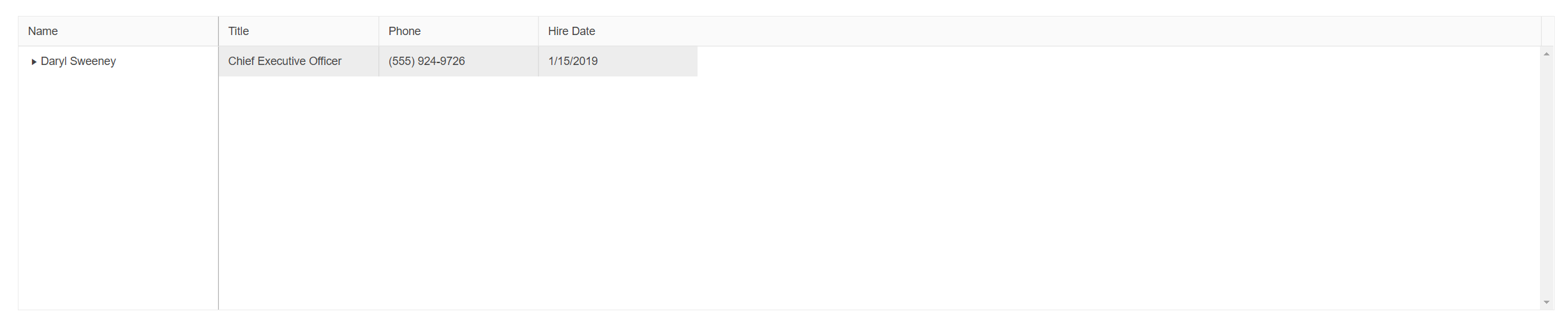
Autosize on treelist with locked columns does not work
When the width of the grid exceeds the column lengths, you would expect autosize to expand and fill the rest of the space evenly.
https://stackblitz.com/edit/angular-7rxada-84kfzy?file=src/app/app.component.ts
Similar to https://github.com/telerik/kendo-angular/issues/3248
Select all checkbox provided in tree list module is not working as expected. Below are the detailed step to reproduce
To Reproduce
Scenario 1 :
- Checked on select all checkbox
- Unchecked any of the row, the select all checkbox still checked.
Scenario 2 with pagination:
- Checked on select all checkbox
- Move to next page
- Select all checkbox is checked, but the rows is not selected
Scenario 3:
- Checked on select all checkbox
- Expand the parent node, the child node is not checked
Expected behavior
Scenario 1:
The select all checkbox should be unchecked. Same as what provided in Grid module
Scenario 2:
The select all checkbox should be unchecked
Scenario 3:
The child node need to be checked
When the user enters each character into the combobox, the system should validate that the resulting value is valid. If not, the system should not display the character
Step to produce:
Give focus to combobox
Type res
System should select Residential
Type z
System should not accept z character (both values in list that start with res do not have a z as the next character)
Type t
System should select Restaurant
Type y
Tap Tab
Expected Result: Restaurant should be selected
<kendo-combobox class="kendo-combobox" [ngClass]="{'inactive-color' : custColor}"
         #comboboxComponent [openOnKendoFocus]="comboboxComponent"
          formControlName="CustType" [data]="custTypes" textField="Description" valueField="CustTypeID"
          [suggest]="true" [valuePrimitive]="true" [allowCustom]="false" (selectionChange)="onCusttypechange($event)">
          <ng-template kendoComboBoxItemTemplate let-dataItem>
            <span class="template_lbl" [ngClass]="{'inactive-color' : dataItem.QInactive}">
              {{ dataItem.Description }}</span>
          </ng-template>
        </kendo-combobox>
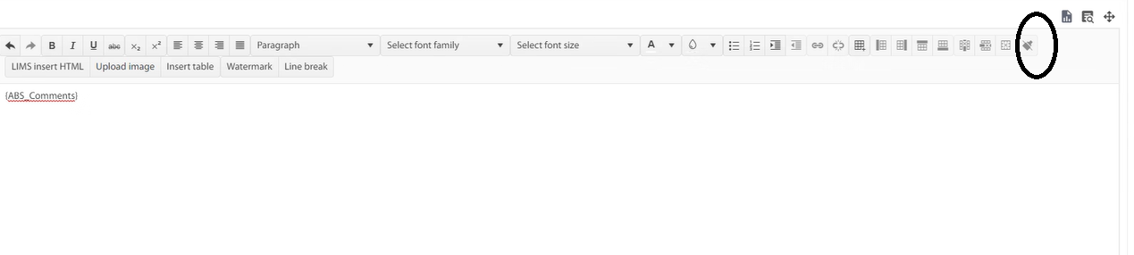
Clear formatting is not working properly , as it removed the span tag and other attributes of the html tags.
For example :
HTML content - before applying the clear formatting:
<p style="line-height: normal;"><strong><em><span style="font-family:Calibri, Candara, Segoe, Segoe UI, Optima, Arial, sans-serif; font-size:11px;" class="ABS_Comments" id="ABS_Comments" name="ABS_Comments">{ABS_Comments}</span></em></strong></p>
HTML Content - after applying the clear formatting :
<p style="line-height: normal;">{ABS_Comments}</p>
It suppose to remove the only the formatting tags instead span and actual tags.
Hi
As per your suggestion we have writing the below code for focusing the cursor position, it is working fine but after putting table on the editor and set the background of the any text is not working . If the table is not placed on the editor and select the background color to the any text working fine.
I think , this would happen because of the below code. Please fix this issue.
Note : Foreground color is working fine in all cases.
The manner in which the Kendo Grid handles multiple column sorting is unusual and therefore not what a user would expect.
I believe that people expect that the column they click on to always be the primary sort column. In the Kendo grid, (when in multi-column mode) this is not the case.
If I click on the "Unit Price" column header, and then on "Product Name", nothing happens. Instead, clicking on "Unit Price" a second time sorts the table by "Product Name". This is not natural.
Instead, this should simply behave like a non-destructive sort. If I click on "Unit Price" and it sorts by that. Then, clicking on "Product Name" should sort everything by Product Name and, if the names are the same, the items would be sub-sorted by the previously selected column: "Unit Price"
I would further ask that the only column that shows the arrow be the primary sort column. Users want to see what the primary sort column is, and not be confused by the other columns, which they will assume are sorted in a reasonable way. The indices help, but I still think that a single arrow denoting the primary sort column would be preferred.
https://www.telerik.com/kendo-angular-ui/components/grid/sorting/
To be backwards compatible, maybe introduce a 'natural' sort mode which would behave in this manner, since I really believe that this is what a user expect.
As a workaround, we put the grid in 'single' mode, and then when the sort changes, we do the following. I limit the number of SortDescriptors to 3 as a compromise between sorting the columns in a reasonable way and yet prevent there from being too many arrows
public autoSortChange(sorts: SortDescriptor[]) {
let singleSortKey = sorts[0];
let newSort: SortDescriptor[] = [];
newSort[0] = singleSortKey;
this.internalSortDescriptors = this.internalSortDescriptors.filter(des => des.field !== singleSortKey.field)
newSort = sorts.concat(this.internalSortDescriptors)
this.internalSortDescriptors = Array.from(newSort);
if (this.internalSortDescriptors.length > 2) {
this.internalSortDescriptors.length = 2;
}
this.gridState.sort = newSort;
this.gridData = ...
}