I would like to request a component similar to the old TreeMap widget, but with some added functionality.  It would be great if there were native functionality in the component to drill deeper into a hierarchy rather than always having to look at the top level view (i.e. clicking a sub node would "zoom in" to view it as the new root level node).

This example treemap and sunburst (implemented using d3.js) are along the lines of what I'm suggesting.

http://mbostock.github.io/d3/talk/20111018/treemap.html
http://bl.ocks.org/mbostock/4348373
Hi,
Is it possible to have synchronized crosshairs for the category axis when there are two or more chart panes in the same chart?
The desired effect I would like to have would look something like this (attached in kendo crosshair.png). Even better if a tooltip can also appear in the other chart pane at the same time (the one not being hovered over).
So far, I have seen that this isn't possible based on this post elated post for jQuery: https://www.telerik.com/forums/stacked-plot-with-separate-y-axis
What I have tried so far to no avail is to take the chart's plotAreaHoverEvent: https://www.telerik.com/kendo-angular-ui/components/charts/api/PlotAreaHoverEvent/, grab the instance of the chart (event.sender) and try to look for a way to make the other chart pane's crosshair appear, but it appears this isn't doable as the crosshair appears to only be rendered when the mouse enters the chart pane area.
Thanks!
Please add a Gantt and Resourcechart component.

See anychart
Hi,
Can you improve the behaviour of AxisDefaultLabels content to automatically use multiple lines when labels are overlapped instead of split them manually by using the function ?
Actual :

Expected :
Thank you for your consideration.
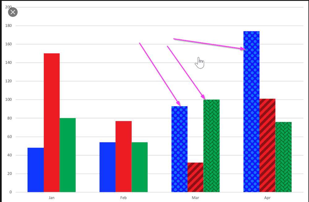
I would like to be able to use a texture, a pattern, or an image as the background of a Kendo chart.
One use-case where this would come handy is a stacked bar chart where all segments of the bar have the same color. A way to visually separate them could be via different textures.
See image below for an example reference:
Hi Telerik,
Is there way to have more configuration options on chart series DashTypes? For example, we'd like to use just dash (no dot), but with the capability of configuring how long the solid/white parts are. Currently, we are limited to 2 options: dash and longDash. We'd like to have more, e.g.,
1, _________ ____________ _____________
2, ______ _______ _______ _______ _______
3, ___ ___ ___ ___ ___ ___ ___ ___ ___
4, __ __ __ __ __ __ __ __ __ __ __ __
Hi,
We really like the Kendo for Angular suite. We were trying to see if the kendo-stockchart could fit our needs with some customization. But this might be difficult to achieve.
We are looking for rendering multiple items within a horizontal timeline.
Unfortunately, we didn't find a good component yet that provides what we are looking for.
Here an example of the kind of functionalities we are interested in.
http://www.simile-widgets.org/timeline/
Is there any plan to provide such component in the near future? or perhaps there is a way we can customize the Kendo chart to do a similar.
Thanks.
-Patrick
Hi,
In the current implementation of the Kendo Chart, I'm utilizing the "panable" feature to enable movement of the chart horizontally. However, after zooming, I would prefer to utilize scrollbars instead of dragging to navigate through the chart. I would like to request a feature that allows for this behavior.
Thank you for your consideration.
Colour gradient on AreaChart would look great - see workaround below:

https://stackblitz.com/edit/angular-x1vrhq?file=app/app.component.ts
Please take a look at this following example: https://stackblitz.com/edit/grouped-bar-chart-missing-values?file=app/app.component.ts
Problem:
The 2nd and 3rd series don't have data for 1/16/2020, but the chart still creates placeholders for where they would have been if there was data for those points.
If there are many missing values in the middle of the group, the outermost values appear as if they belong to the adjacent groups (they are visually closer).
Desired behaviour:
I would like the option to omit the blank space created for each missing value. The end result should be that missing values don't generate gaps and all the existing values cluster directly adjacent to each other. Clarifying example below.
I understand that this is not a bug and that it can be useful to have the placeholders for missing data, but would like to have the ability to not have them take up space. Over multiple dates and with 10-15+ series the chart can start looking very confusing with which date the bar actually belongs to.
This is somewhat related "missingValues", but differs in that instead of replacing a missing value with something (even a gap), here we want the component to behave as if it never existed.
The behaviour could be optional and toggle-able through a property binding, e.g. [hideMissingValues]="true".
The legend in the kendo charts has limited customization available via geometry and layouts (inherited from Group <- Element) using the visual property. But this does not allow a complete range of customization equivalent to html templates such as :
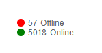
1. Table containing multiple information against each legend item. (eg : If the above legend consists of multiple items in a row could use Kendo grid in it).
2. No hyperlinks support in the text for routing to different pages on the UI or anywhere else.(eg : In the above Offline could be a hyperlink to navigate to other detailed page).
This point I think is important. Also an hyperlink (or maybe a click on an svg hide navigate to a separate legend in place).
3. Some other features supported in html such as sliders in a legend to display more info on icon click. (eg : clicking on an icon should expand the details for each legend item ).
4. Not sure if there is an svg support too. (eg: In the above I would like to place an svg icon in place of circle geometry for colored indicators).
Also it would be much convenient to allow an html template inside the legend instead of coding geometries. The above points are in support for the need for a custom html template to be either accepted as the property of the legend or to allow to construct an html code under the <kendo-chart-legend></kendo-chart-legend>
I need to change the background of an area chart at certain values.
I want to display critical threshold. It could be like in the attached photo with some gradient but normal color blocks or even just some straight lines at the thresholds would be okay. Is there any option to achiev something like that?
Please provide kendo Gantt chart supporting for angular 5
We have a case with a chart with values: Date-Value that only applies to working days.
Non of the current options of missingValues ("gap" | "interpolate" | "zero") suits us. Interpolate is the closest option but it pretends to have 2 additional points (Sat & Sun) between Friday and Monday while we prefer just to connect directly Friday and Monday so both label and chart-line shape showns that 4 weeks (28 days) data based chart is based on 20 points and not 28 points (20 real points and 8 interpolated points).
Can this be achived currently? If not can you extend missingValues with additonal option (eg. "ignore") to do as explained above?
Thanks,
Tomasz
Hi,
Please provide an option that allows forcing the chart to use whole numbers for its value axis when zooming in or out. It's not something uncommon to have charts that can't have decimals (eg. number of people).
Thank you
We have this feature in Kendo Grid:
<ng-template kendoGridNoRecordsTemplate>
  <fa-icon [icon]="faCloudXmark" class="fa-2x"></fa-icon>
  <p>There is no data to display.</p>
</ng-template>It would be great to have some support for charting hierarchical data in the Angular 2 Components. It would be especially nice to see something like the old TreeMap widget brought into the library and extended such that the data visualization could change (specifically a sunburst chart option would be really nice). Additionally, it would be great if there were native functionality in the component to drill deeper into the hierarchy rather than always having to look at the top level view (i.e. clicking a sub node would "zoom in" to view it as the new root level node). This example treemap and sunburst (implemented using d3.js) are along the lines of what I'm suggesting. http://mbostock.github.io/d3/talk/20111018/treemap.html http://bl.ocks.org/mbostock/4348373
Currently, the width property is available only for horizontally oriented legend:

Provide an option to set the width of the legend when orientation is set to vertical.
I would like to have two-way data binding on some properties that are set by components themselves. Currently no output is offered for things like the min and max values of axes. It seems they can only be set, not read.

Ideally, I would like to do something like this:
        <kendo-chart-y-axis-item [(max)]="yMax" [(min)]="yMin">
        </kendo-chart-y-axis-item>

    <input type="number" [(ngModel)]="yMin" />
    <input type="number" [(ngModel)]="yMax" />