1. Start using the Kendo Tree View in Angular.
2. Load a large dataset for the Kendo Tree View, observe the time taken to render the Tree View.
3. The timing will increase if the dataset keeps on increasing.
4. Suggest some ways to reduce or optimize it.
This is how I am using the Kendo TreeView in Angular,
Hi team.
We would like to provide a possibility to use our specific masks for Date Picker component, like this:
- d.m.y = Current date
- 1.m.y = 1st day of current month
- 31.m.y = Last day of current month
- etc.
Can you recommend a good solution for this?
When you have a very long list of items to display in the tree view its not always ideal to have a vertical scroll. In order to better utilize space and allow for the user to see more options on the screen at once it would be nice to have a configuration to allow for the list to be split up into columns. So for example if you have a list of 90 items, you can maybe have 3 columns of 30 items each. Please see the attached image that demonstrates what I am referring too.
The Kendo Silverlight does have something similar: https://docs.telerik.com/devtools/silverlight/controls/radtreeview/how-to/create-horizontal-treeview
Currently it is possible to override certain messages of the kendo grid with the KendoGridMessages component.
However, this applies the message to the entire grid at once.
For example assume I have a grid with 2 boolean value columns, I would like to override the filter menu IsTrue & IsFalse messages to another string.
This is entirely possible with the KendoGridMessages component.
After the columns in my grid I might put something like this:
This would work if I wanted both boolean filter menus to display Yes & No.
But lets suppose I have set a template for cells in one of the columns like so:
the cells in this column would now display 'Validated' or 'Not Validated' instead of true/false.
It would make more sense for this column filter menu to have 'Validated' & 'Not Validated' instead of the Yes/No message that has been set to the entire grid.
Currently I would have to choose between one or the other strings for the boolean filter, either Yes/No or Validated/Not Validated.
This is a simple example, and in this case using the Yes/No messages for both wouldn't cause a user too much head-ache, but there are plenty of other more complex use cases where not having individual grid messages could cause confusion.
Here is a Stackblitz where I have mocked the grid:
https://stackblitz.com/edit/angular-qynsrr?file=src%2Fapp%2Fapp.component.ts
In the above Stackblitz I've mocked what I would expect it to work like.
I would expect that you can add a KendoGridMessages in the grid to set a default, and then on each column override it as necessary with another component or another KendoGridMessages.
Would like the API expanded to include support for adding your own tool(s) that would allow you to tag the selected text with custom html tags.
For example, would like to be able to highlight some text, hit the custom button and then "text goes here" is replaced with "<custom>text goes here</custom>". From some documentation research, it looks like you don't support custom tools that would be able to accomplish this, is that correct?
From this previous post, it states that such a thing is not supported?
https://www.telerik.com/forums/add-custom-tool
Currently kendo ListBox does not support double click event.
Implement kendo ListBox in Angular.
Double click on a row.
No event is emitted.
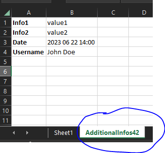
input to grid:
@Input()
public additionalExcelExportInfos: { additionalWorksheetTitle: string,
parameters: { key: string, parameterValue: any }[]
};
output in excel file:
When I drag an element to the drop target, automatically move the existing element in the drop target to the drag target. In short, switch the position of the elements.
In this case, moving Panel 2 over Panel 1 should automatically move Panel 1 underneath:
https://stackblitz.com/edit/angular-tg3xjq-1e5svz
I would love to create some predefined values, and when the user selects the value from the dropdown, it will insert it in the cursor position.
This will give us the ability to define some placeholders in the text.
Hi team,
Zoom in /out options are required to view the content of the editor.
Regards,
Babu
We are using placeholder like <span id="P_Name" name="P_Name">{P_Name}</span> . this would replace with the patient name on loading the editor.
we used the ContentEditable = false is not working for the span. Some important content such as patient information should be read-only.
attached the sample editor content , the below content are loading dynamically , so we should restrict user should not edit the conent.
Hi there,
we'd like to raise a change request in relation to column widths on grids:
https://www.telerik.com/kendo-angular-ui/components/grid/columns/width/
Currently, we can either set a fixed width on a column, or not set a width at all and leave it dynamic. Our problem is, that we have some columns that would benefit from additional space if it is available (e.g. on a larger screen), yet really suffer if they do not receive enough space.
When we give such a column a fixed size, we have to choose an amount that will still leave other columns enough space on smaller screens, and since it is fixed, is does not increase in size with larger screens.
If we don't set a fixed width, (or give all columns a fixed width), the available space will be distributed evenly/proportionally among the columns. So here, the columns do benefit from extra space, but the problem is that on smaller screens, they also can become too small to display the content.
We would like to be able to set a minimum width on columns. We imagine the behavior to be as follows:
If there are some columns with a fixed width and some with a min. width, and
- the available space is less than the sum of the fixed and min. widths -> a horizontal scrollbar is added
- the available space is more than the sum of the fixed and min. widths -> the additional space is distributed among the columns with a min. width (evenly or proportionately, either option is fine)
Hi,
When the Editor content is large, typing in the component doesn't show the typed characters immediately. Depending on the content users may need to wait several seconds to see the typed character.
An example of the performance problems can be found in the following example. The used value is dummy Lorem Ipsum, but we are still having the same problems while showing important information:
https://stackblitz.com/edit/angular-hv89jm
Hi there,
It would be extremely useful to have some sort of global configuration for component settings / inputs.
For example: I want to remove animation from all of my dropdown lists.
This should be easier. The default workflow is to configure each and every instance of DropDownList using the component's input properties.
Less than ideal workarounds
- Create an angular directive that auto configures a given Kendo component and apply that directive to each instance of your component.
- Wrap a given Kendo component in a custom component, and configure it there. This will break the Kendo component's form integration, and you must implement the wrapper component to account for this.
Thank you.
Hi,
Currently, it seems impossible to have a global search field that look up into a given number of columns.
The idea would be to: either have a bindable property (like "searchString"), either having just an option to activate a "global search"(and you would add the search component).
It would also be required to be able to provide a list of "fields" to search in.
Obviously, when the search string change, it should reset the paging.
It's something we have to implement again every time we use your Grid(and it's quite hard to make a wrapping component because there is a lot of things to customize. You can check how the global filter is implemented: PrimeNG (primefaces.org)
Hi
On click of a label, I want my kendo numeric textbox to have focus, but it is not working. Following is my code.
<label for="kid">Currency</label>

<kendo-numerictextbox
  [attr.id]="'kid'"
  [format]="formatOptions"
  [min]="min"
  [max]="max"
  [step]="step"
  [autoCorrect]="true"
  [spinners]="false"
  [formControl]="control"
  [changeValueOnScroll]="false"
>
</kendo-numerictextbox>
Issue is because, at the run time kendo generates a random ID, and appends that ID to the input box(.k-input) , instead of appending the id given by the user as above. This is causing the issue and focus is not set on input box when clicking in label. Could you please check it and suggest a solution.
"@progress/kendo-angular-inputs": "^9.0.0",
I know to associate any Kendo UI component with the Label, template reference variable is the way to go.
<label [for]="numerictextbox">NumericTextBox: </label>
<kendo-numerictextbox #numerictextbox>
</kendo-numerictextbox>
But what if my label and input box are coming from different components, then this template ref variable approach would not work. So i would suggest kendo to use traditional ID approach to set the focus on input element.
Kendo can use HostBinding property from Angular , to remove ID from kendo-numerictextbox level, and adding the user supplied ID directly to inner input element.
@HostBinding('attr.id') _id = null;

  @Input() id?: string;
Thank You
The Scheduler recurrence editor numeric inputs automatically change leading 0 inputs via keydown or pasting to 1's or empty values.
Extend the ability to disable the mandatory autocorrection for all recurrence editor inputs so any numeric value can be entered.