Please provide built-in way to set attributes to the internal Input element. These can be HTML attributes like "autocomplete", "aria-describedby" and others, and also custom attributes if such are required.
Currently the only way to set attributes is programmatically, for example through a custom directive:
https://stackblitz.com/edit/angular-douddd?file=src%2Fapp%2Fapp.component.ts
Related feature request - https://feedback.telerik.com/kendo-angular-ui/1582022-set-area-describedby-and-area-labelledby-to-form-controls
I have a project that uses Kendo UI for jQuery to work with spreadsheets. I want to recreate the project from scratch in Angular using the Kendo UI for Angular Spreadsheet component.
In jQuery, I am currently using `kendo.spreadsheet.defineFunction()` (docs) to define our custom functions and I would like to do the same in Angular.
Hi, Team!
I would like to have a designated Timeline View that displays a whole year.
Best regards!
I need an Angular control works pretty much like Kendo-JQuery Autocomplete control or Telerik Asp.Net Auto Complete text box.
I understand that Kendo-Angular currently have an "auto complete" control based on a dropdown. However, it is missing some core features I am looking for:
1. It needs to accept multiple inputs.
2. It needs to eliminate unmatched results based on user input.
3. It needs to call a server side API to get the available items dynamically after input changes.
The current Kendo-Angular AutoComplete MIGHT have the 3rd point since I have not yet to try with all the events, but I am pretty sure that the first 2 points are not there. If they do exist, please provide demo or documentation link.
Thank you.
Provide a template that allows modifying the following time slots for the TimeLine view.

Hello, Team!
I would like to have a timeline view with custom number of days/weeks.
Given a file is selected using the fileselect component
And one or more of the restrictions bound to the control are violated
The error message that is displayed should be configurable
For example, if the maxFileSize restriction has been set to 20mb and a file larger than that is selected, the control currently displays some error text to the user as follows: "File size too large". It would be beneficial if we could override this message so it (for example) could say "File size too large. The maximum file size is 20mb".
So far the SplitButton behaves as a single tab stop component. But the component is created by two buttons, one which triggers a single operation and the arrow which only opens the popup.
The arrow should be part of the Tab sequence so the user can open only the popup without the need to use Alt+Down arrow combination.
Hi,
The cell template would be a good addition to the PivotGrid component allowing developers to customize the cell content.
Thank you for your consideration.
If the cursor is over the input after changing a date scrolling with the mouse wheel makes the value change.
We need a property just like this one:
https://www.telerik.com/kendo-angular-ui-develop/components/inputs/api/NumericTextBoxComponent/?&_ga=2.113010244.1182956334.1653485754-1241247116.1645472843#toc-changevalueonscroll
Would really like a Kendo UI version of the Chip Input like the one from Angular Material https://material.angular.io/components/chips/overview#chip-input
I was surprised looking through all the components that something like this didn't already exist
Hi,
I am looking for the ability to alter the date range in the month view such that a month view for TODAY - 3/24/2022 would show 3/20 - 3/26. Where TODAY would be in the first row of date slots that get rendered.
We need a "month view" that can not have the first week rendered vary by date. (outlook calendar month view does this) see attached.
Thanks
(for further reference please see private support thread: 1443943)
[isDisabled]="disabled || isDisabled(node, nodeIndex(index))"
Because of the hardcoded disabled property, isDisabled cannot be reliably used to control which item is disabled.
Disabling the parent node automatically disables the entire tree under it and isDisabled is never called for those items.
It should behave like other functions - isChecked, isExpanded, isVisible etc - where you have full control over which item does what.
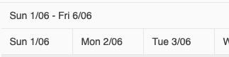
Currently, there is no way to format the dates in the timeline headers of the Gantt component.
It would be beneficial if developers do have the option to format the dates or in some way control the content of the header. For example, "Sun 1/06" can be displayed differently, e.g. something along the lines of "Sun Aug 1" or "Sun 01.06", etc.