Delete the input, choose a date from the dropdown. The issue is that the first picker remains invalid, while it is valid, a keyboard interaction with the input is required to clear the invalid state.
Reproducible:
@using System.ComponentModel.DataAnnotations;

    <EditForm Model="ModelData">
        <DataAnnotationsValidator />
        <ValidationSummary />
        <br /><br />
        <span>Not nullable</span> @ModelData.Date<br />
        <Telerik.Blazor.Components.TelerikDatePicker @bind-Value="ModelData.Date" Min="DateTime.MinValue" Max="DateTime.MaxValue"></Telerik.Blazor.Components.TelerikDatePicker><br /><br />
        <span>Nullable</span> @ModelData.Date2<br />
        <Telerik.Blazor.Components.TelerikDatePicker @bind-Value="ModelData.Date2" Min="DateTime.MinValue" Max="DateTime.MaxValue"></Telerik.Blazor.Components.TelerikDatePicker><br /><br />
    </EditForm>

@code  {

    public MyModel ModelData { get; set; }

    protected override void OnInitialized()
    {
        ModelData = new MyModel();
    }

    public class MyModel
    {
        public string Name { get; set; }

        [Required(ErrorMessage = "Non nullable required")]
        public DateTime Date { get; set; } = DateTime.Today;

        [Required(ErrorMessage = "Nullable required")]
        public DateTime? Date2 { get; set; } = DateTime.Today;
    }
}
For some reason I'm unable to select the date 01/03/2000 when using the date picker to select the date. Only thing special about this date is its exactly 24 years ago today.
I was able to reproduce in repl. https://blazorrepl.telerik.com/QyYFkdbU34QbG0Te32
I also attached a video so you can review the steps followed and result.
Steps to reproduce
- Add a DatePicker
- Bind it to nullable DateTime object
- Use the dd.MMM.yyyy format
- Select any date and when the popup is closed press any numeric key on the keyboard.
Currently, if the ReadOnly parameter value is set to 'true,' the user can modify the value of the DateInput by using the arrow keys.
Reproduction: https://blazorrepl.telerik.com/mxaiabvd178zy7p948
When attempting to insert a date of February 29th (2/29) in the DatePicker component with the AutoCorrectParts feature disabled, users are unable to input the year. The component only allows the insertion of the digits 0, 4, and 8, preventing users from selecting other year values.
Reproduction: https://blazorrepl.telerik.com/mxagmaPm39IQbjHw19
Hi
When you focus on the DatePicker input element the cursor is at the end of the input instead of the start.
Here is an example
https://blazorrepl.telerik.com/ccOtaTOZ59tdXv1J10
Any help would be appreciated
Regards
Stewart
DatePicker cursor not advancing after month input. The problem arises when dd/MMM/yyyy format is applied.
To reproduce the issue open this REPL example. Type any date in the second DatePicker. When inserting a month value the cursor is not moved to the year section.
After inserting a month the cursor should be moved to the year section. As when no format is applied (the first DatePicker)
Hi
I have created a REPL here: https://blazorrepl.telerik.com/QHYGbTPk59IqOcEU51
to reproduce the issue I am talking about:
- click on the cell
- Press the 'Delete' Key
- Press the 'Enter' Key
you will notice that the value displayed below the table is what was previously in the cell
I would have expected the value to be null which can be achieved via
- click on the cell
- Press the 'Delete' Key
- Click outside the cell
- See the DatePicker Validation Demo
- Highlight the year
- Start typing 2029
- See that even on the first input stroke the validation is triggered.
<Admin>
As a workaround, you can add the DebounceDelay parameter with a high number as in this REPL link.
</Admin>
When testing your datepicker control in NVDA, there are a number of accessibility issues.
- The dateinput portion of the control does not account for users entering full dates into the control, meaning if a person was to try to type 2/23/2022 into the input where they included the slashes, it would throw them into the year section when they thought they were entering the day section. My suggestion via this forum link (https://www.telerik.com/forums/ignore-forward-slash-allow-various-formats-when-using-date-input) is to alter your date entry logic to allow users to both enter the dates without the slashes (which is what you have now except under a few edge cases where a slash is needed to move to the next section like 2 2/ 2022) as well as include the slashes where if the user is on the first digit of the day section and the / is pressed, do NOT advance them to the year section. While this can be an annoyance for a sited user because they end up accidentally entering the day in the year section when they try to use the slashes, they can at least see what went wrong, and then go back and fix it. For a screen reader user, they are not notified of the auto advancement, and so they have no idea that they have entered an invalid date until the leave the control and then tab back to it, or if they were to try to submit the form and get an error.
- The dropdown portion of the control is not being read properly by NVDA. When you first drop it down via alt-down arrow, it will actually write all of the table text to the Speech Viewer window, but nothing is read.
- Then, once you try to arrow to a date, nothing is read at all. You can tab to the month and previous/next buttons and they are read.
- Opening the Month section of the dropdown doesn't read the month out when arrowing through the months.
- Tabbing to the previous or next buttons and then pressing them with enter reads all of the dates in the table.
- Arrowing up or down within the days reads all of the dates in the table when it advances to a new month, but reads nothing otherwise.
I am using the latest version of NVDA 2021.3.3 on Chrome Version 98.0.4758.82 (Official Build) (64-bit). I will note that Jaws and Chrome work properly regarding the dropdown issues, so it may be an NVDA thing, but maybe some research can be done to see if there are some different aria attributes that will work so that if functions properly with both screen readers. For example this Aria Best Practices Date Combo Box example at least reads where the user is with the arrow keys. https://www.w3.org/TR/wai-aria-practices-1.2/examples/combobox/combobox-datepicker.html It is not perfect, but it is better than not being read at all.
And even outside of the date dropdown stuff, the date input portion (#1) above is an issue across the board. I know that it is a design decision that you guys have made, and that you have provided documentation as to why and how to use it, but most users are going to type in the slashes of a date, and it's not reasonable to write up a half page of documentation within my app to let users know how to use the control. I can't even put a short label that says enter date without slashes, because under some circumstances a slash is necessary, so it becomes confusing to the user, and screen reader users will get lost if they make a mistake because they are not informed that they have just switched to a different section.
Thanks.
The problematic setup:
<TelerikDatePicker Min="@Min"
                   Max="@Max"
                   @bind-Value="@selectedDate">
</TelerikDatePicker>


@code  {
    public DateTime Max = new DateTime(2021, 3, 29);
    public DateTime Min = new DateTime(2021, 3, 1);
    private DateTime? selectedDate;
}
When using an abbreviated month in the date format, the picker will not automatically move to the next element (year) after entering a month. If I enter 04 for example, the focus remains on the month.
When using a numeric month in the date format, the picker will automatically move to the year after entering a month.
See an example: https://blazorrepl.telerik.com/cmOzPgFc08d1woml09.
I want to apply some custom CSS to hide the disabled dates. However, it appears that k-state-disabled class is not applied to all of them.
For example, if I set the Max parameter to October 15th 2021, the remaining dates of October have the k-state-disabled but the ones in November only have k-other-month class.
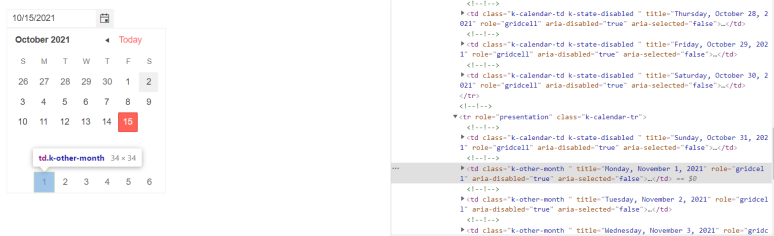
The same behavior occurs when I set the Min parameter - the dates from the previous month do not have k-state-disabled class.
===========
ADMIN EDIT
===========
Note: This bug also affects Calendar, DateRangePicker and DateTimePicker components.
As a workaround for the time being you might try another approach - all the disabled cells have aria-disabled = "true" attribute which you can use as a CSS selector to target the disabled cells:
<style>
    [aria-disabled="true"] {
        visibility: hidden;
    }
</style>

<TelerikDatePicker @bind-Value="datePickerValue" Max="@MaxValue"></TelerikDatePicker>

@code  {
    DateTime datePickerValue { get; set; } = new DateTime(2021, 10, 1);
    DateTime MaxValue { get; set; } = DateTime.Now;
}